top of page


Brand Identity
Your brand identity is more than a logo — it’s the visual language that communicates who you are and what you stand for. I craft distinctive logos, color palettes, and typography systems that reflect your values and connect with your audience. Each identity is designed with consistency in mind, ensuring it works seamlessly across digital platforms, print materials, and real-world applications. Whether you’re building a new brand or refreshing an existing one, I create identities that are timeless, professional, and built to leave a lasting impression.
Logo Design
Logo design is the foundation of a brand identity. Each logo here reflects a distinct brand personality, supported by custom typography and tailored color palettes. From luxury retail to playful kids’ branding, every project demonstrates how a strong logo becomes the centerpiece of a cohesive visual system.

A playful yet stylish logo variation designed for the artistic branch of Lemaitre. Featuring bold red and black tones with a hand-drawn brush typeface, it brings warmth and personality while staying recognizable as part of the larger brand.
Your brand identity is the foundation of how you are recognized
My logo designs are built to capture the essence of each brand while ensuring versatility across platforms. Each identity is supported by a carefully curated color palette and typography system, creating a consistent visual language. From luxury retail and real estate to playful kids’ branding and bold food concepts, these logos show how design can adapt to different industries while staying memorable, professional, and impactful.
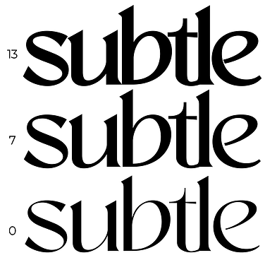


Subtle was designed with elegance and modernity in mind, blending refined typography with a grounded color palette. The use of Sangu and Mangro typefaces creates contrast between sharp structure and fluid form, while the muted tones of navy, green, and soft blue balance sophistication with approachability. This identity captures the understated confidence of a fashion brand that values both style and substance.
Clean and minimal, this logo highlights professionalism and modern design. Paired with monochrome palettes and structured type, it reflects clarity and authority for a marketing and creative brand.”


This logo suite was created for a luxury interior design brand, balancing elegance with timeless appeal. Using Optima typography and a deep, rich palette, it conveys exclusivity, craftsmanship, and sophistication.


Modern and bold, the Ben Kruger logo reflects strength and trustworthiness in the luxury real estate space. Its black-and-white palette with clean typography creates a confident, professional presence.


Dynamic and fiery, this logo blends bold typography with strong bull imagery and flame-inspired colors. It’s designed to stand out in food campaigns, delivering energy, excitement, and instant recognition.


A refined wordmark paired with soft, ocean-inspired colors and elegant typography. The Savaro logo captures sophistication and timeless style, making it a perfect fit for a luxury fragrance campaign.


Don Daniel’s identity was created to be playful, colorful, and instantly appealing to children and families. Using the rounded, friendly forms of Simple Candy Regular typography and a vibrant palette of primary colors, the logo communicates energy, fun, and creativity. The cheerful character-driven design brings warmth and personality, making it ideal for a kids’ chef brand centered on joy and imagination.


Aesthetics

Paladino HCM's Branding Collab


Personal Branding Collabs


bottom of page